White balance changes the relationship between the colour recorded by the camera and the way neutral objects appear in the image. A neutral starting point can make comparison easier, but it is not a command to remove every warm or cool impression. Candlelight, late sun and a shaded interior can be part of the photograph's subject rather than errors to erase.
Begin with one dominant light source if you can. A face lit by a window on one side and a warm lamp on the other may contain two different colour influences. A single global setting cannot necessarily make both sides neutral. Decide which light matters most, change the lighting arrangement where possible or accept a deliberate difference instead of chasing an impossible uniform correction.
Make a reference that belongs to the scene
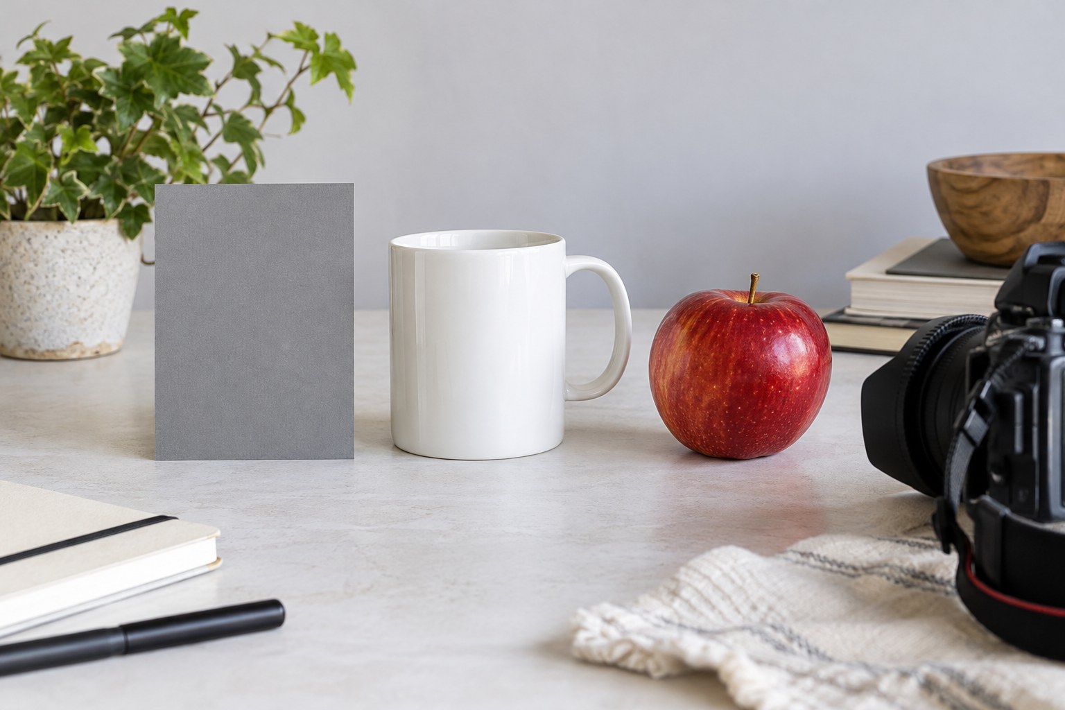
Use a neutral reference intended for photographic colour evaluation and place it in the same light as the subject. A random white wall or sheet of paper may have its own colour and may receive different illumination. Keep the reference properly exposed and free from a bright reflection, then use the application's supported sampling or custom-balance method.
Take a reference frame when the light changes significantly rather than assuming one measurement covers the entire session. A subject moved deeper into a room or beneath a different lamp may need a new reference. Keep the reference photograph with the sequence so that later editing has evidence of the lighting rather than only a remembered impression.
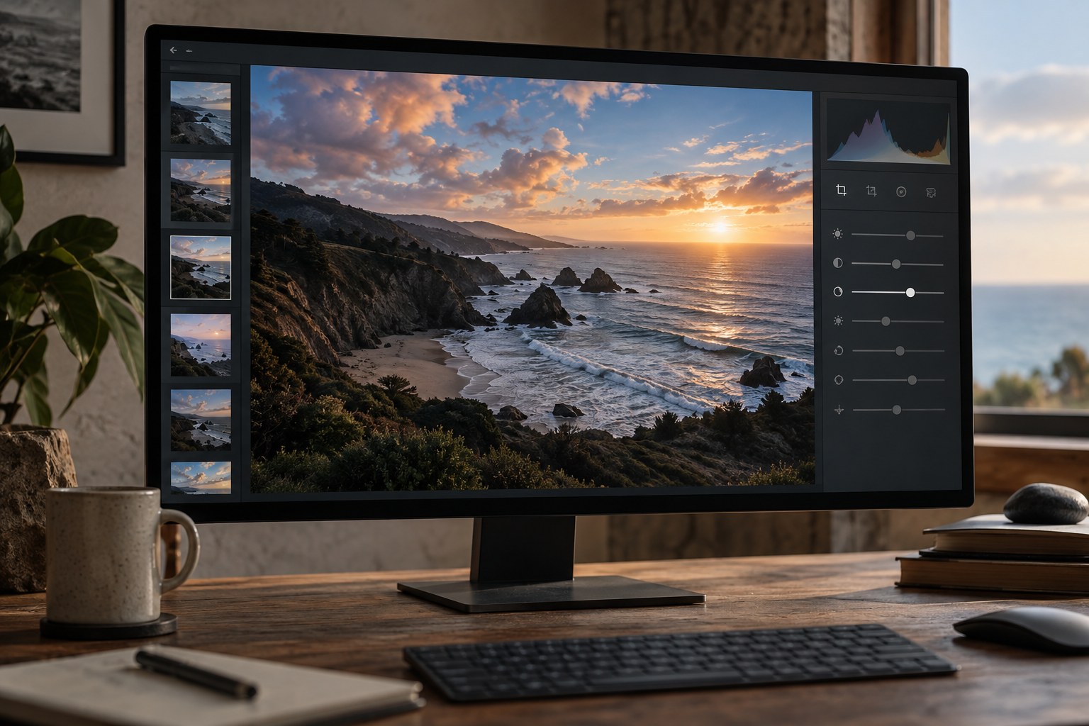
After applying the starting balance, look at familiar neutral areas and the main subject. Check for a green or magenta cast as well as excessive warmth or coolness. Temperature and tint controls address different directions of colour change; moving only one may not solve the observed problem. Make small, deliberate adjustments and compare with the starting state.
Keep the atmosphere when it is part of the image
A neutral reference photographed under warm light can lead to a technically neutral rendering that feels unlike the intended scene. Decide whether the goal is consistent object colour or the experience of that light. A product illustration and a candlelit dinner may reasonably lead to different choices from the same neutral starting point.
For a series, compare related images together. Do not force every photograph to the same numeric setting if the light changed. Instead, look for coherent skin tones, neutral objects and transitions between scenes. Conversely, applying a different automatic correction to every frame can create distracting variation when the lighting was actually stable.
Inspect the exported image in a colour-managed viewer and remember that a display's temporary warm mode can influence your judgement. Preserve the original and the reference frames so that the balance can be reconsidered for another use. The reference reduces guesswork; the final colour decision still belongs to the photograph's purpose.
When the reference and the subject disagree
Suppose a grey reference beside a face samples as neutral, yet the face still appears green on one side. Look for reflected light from a coloured wall, clothing or nearby foliage. The reference may occupy the main light while the face receives an additional reflection. Moving the card into the same lighting relationship, changing the subject's position or reducing the coloured reflection addresses the cause more directly than pushing the whole image towards magenta.
If the scene cannot be changed, decide whether a restrained local correction is justified and check its transition carefully. Keep naturally coloured areas, such as lips or clothing, from being neutralised along with the cast. Compare the corrected face with the rest of the scene at normal viewing size. A locally neutral patch that no longer belongs to its surroundings can be less convincing than a modest remaining influence from the actual light.