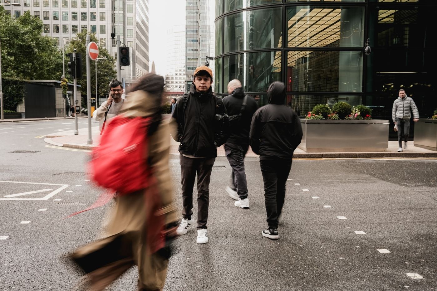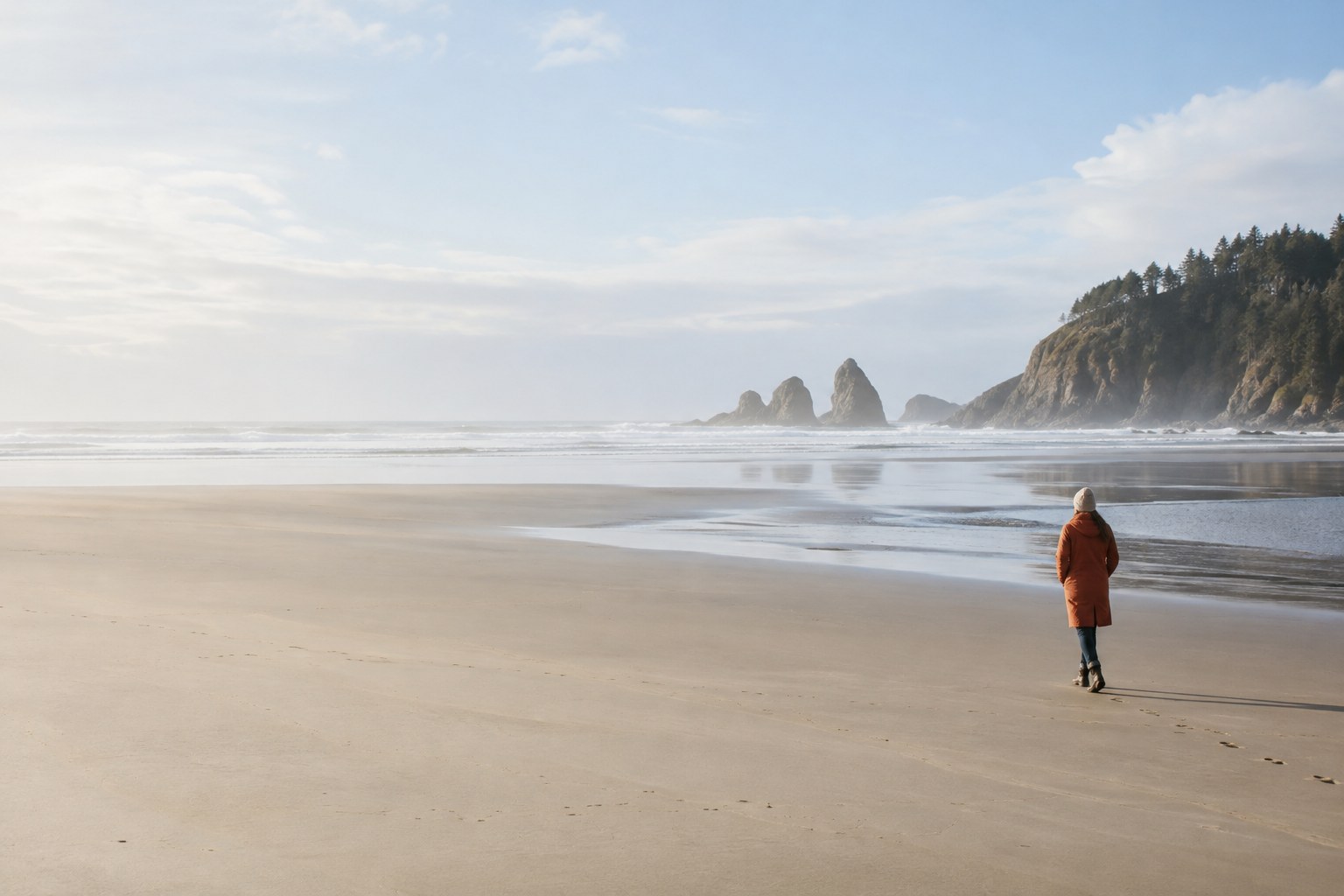
Negative space is the area around a subject that helps define its presence. It may be sky, a plain wall, water or a softly rendered background. It is not necessarily empty, but it should not compete equally with the subject. A small figure in a broad space can feel isolated, calm or vulnerable depending on the setting and the direction it faces.
Start with a subject that remains identifiable at a small size. A distinct silhouette, a clear colour contrast or a recognisable gesture helps. If the viewer must search too long to understand what the photograph concerns, the surrounding space may be too dominant or the subject may need a different position.
Inspect the space for bright flecks, signs, branches and tonal patches. A single small distraction can become important when there is little else in the frame. Move the camera or wait for the interruption to pass rather than assuming every imperfection must be removed later. Subtle texture can remain if it supports the atmosphere without becoming a second focal point.
Try placing the subject closer to one edge and then nearer the centre. An off-centre placement can create direction or tension, while a centred placement can make the surrounding space feel deliberately balanced. Leave room in front of a gaze or movement when that supports the picture, but compare the opposite arrangement if you want a sense of constraint.
Exposure still belongs to the intended subject and mood. A large bright background can make a dark subject too dark under automatic metering; a large dark background can cause the reverse. Check the actual subject after reframing. Keeping exposure consistent during your comparison makes it easier to judge placement without being distracted by changing brightness.
Consider where the photograph will be used. A wide composition may work on a page but lose its subject in a small thumbnail. If text will be added, leave an area with enough tonal consistency for it, but do not assume that all negative space is automatically suitable for lettering. A subtle gradient or texture can still make text difficult to read.
Review the image after a short pause. Ask whether the space creates a relationship with the subject or merely pads the frame. Crop a copy tighter and compare the feeling. The wider version should offer a distinct reason to exist: distance, scale, direction or quiet, rather than simply more background.