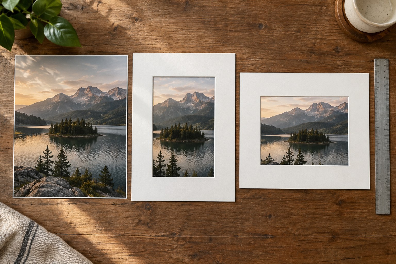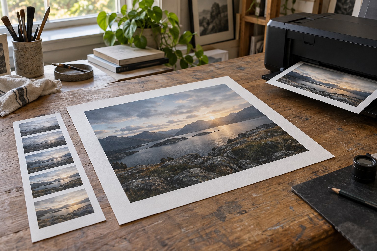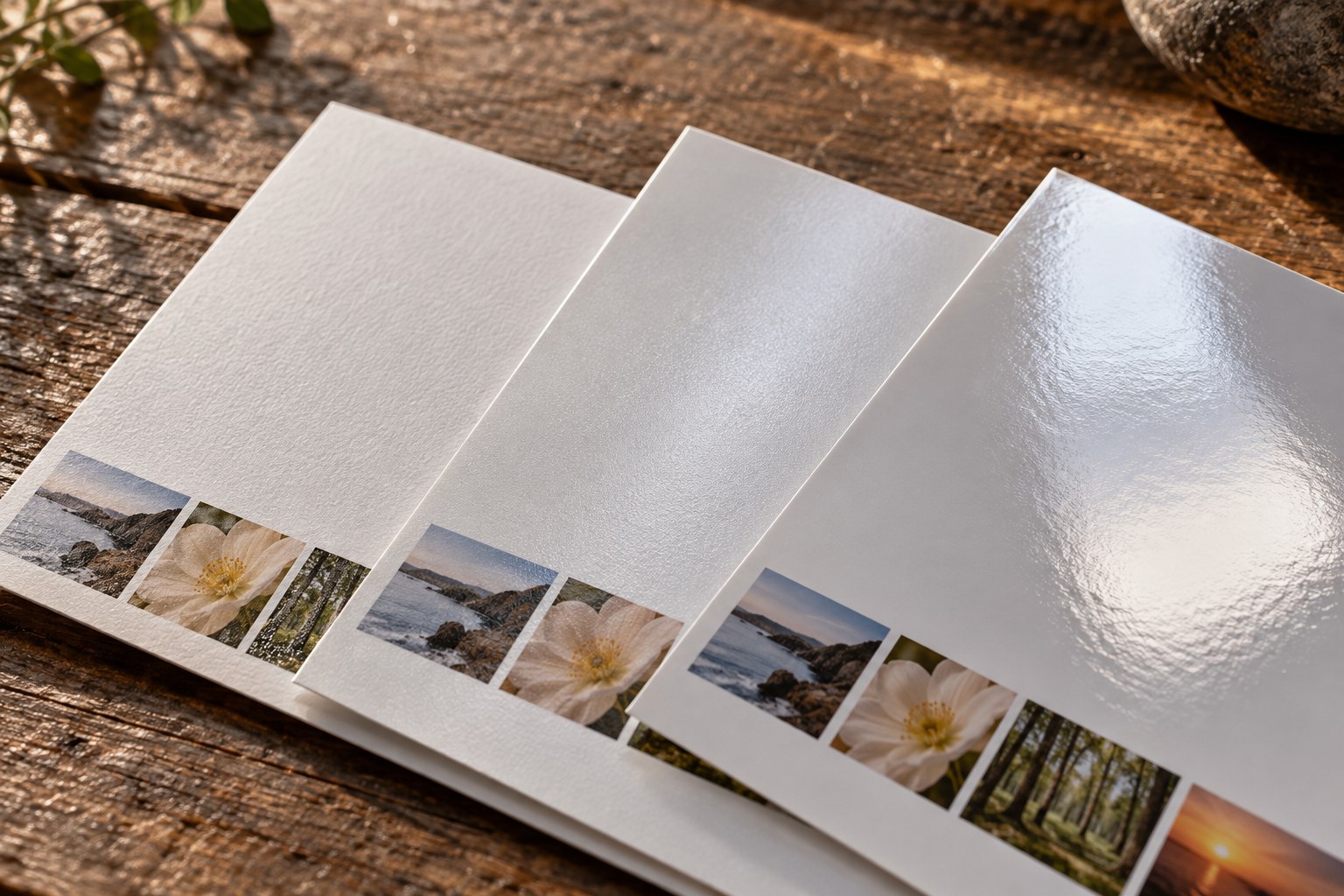
Paper is part of the visible photograph. A surface can change the way reflections compete with dark tones, how fine texture appears and how the print feels when held. Choosing from the words “matte” and “glossy” alone leaves too much unspecified. Smooth matte paper and a strongly textured matte sheet may behave very differently with the same image.
Begin with the photograph and its destination. A print viewed in an album at arm's length has different conditions from one framed opposite a window. Note whether the image depends on small details, broad colour areas, deep dark tones or delicate pale transitions. These observations give a paper comparison something concrete to answer.
Compare two surfaces, not two edits
Use a sample pack or order modest test prints of the same file on two plausible papers. Keep the image dimensions and preparation comparable. If one test is much brighter or more heavily sharpened, it becomes difficult to separate paper behaviour from editing choices. Ask the printer which preparation settings are required for each material rather than guessing from the paper name.
Look at the samples first from the intended viewing distance. Can you still read the important shadow shape? Does surface texture compete with a face or a smooth sky? Then move closer to inspect small detail. A textured surface can be part of the image's physical character, but that does not mean every photograph benefits from it.
Tilt each sample gently under the actual room light. A glossy surface may reveal a bright reflection at one angle; a less reflective surface may be easier to view there. This is a placement question as much as a quality question. If the print will sit behind glazing, test the complete arrangement where possible, because the frame adds another reflective surface.
Do not use paper thickness as a substitute for judging the image. A substantial sheet may feel satisfying in the hand while contributing little once hidden behind a mount. Conversely, a paper suitable for a flat print may not be compatible with a particular book binding or home printer feed. Check the physical requirements separately from visual preference.
Keep a comparison record that is small enough to use
Write the paper name, printer or service and file version on a separate note associated with each test. Avoid marking the image surface. Record what you observed under a named light or in a particular room, rather than declaring one paper universally superior.
Choose the surface that serves the photograph's role. A consistent paper can unify a series, but an occasional change may be justified by a distinct presentation. Keep the rejected sample: it may suit another image, and it is more informative than trying to remember a finish from a product photograph on a screen.