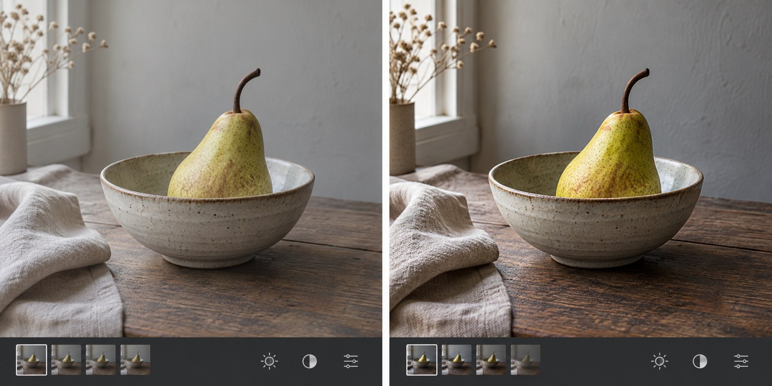
After several minutes of editing, a stronger colour or contrast setting can begin to look normal. Moving the same slider a little farther then seems like another improvement, even when the photograph is drifting away from the reason you selected it. A comparison with the starting image interrupts that adaptation. It works best when you know what the starting image actually represents.
For a raw photograph, the first visible rendition is already a software interpretation. It includes a profile and processing defaults; it is not an untouched view of sensor data. For a JPEG, the camera has already applied processing. Save a clearly named baseline before your own adjustments so that later comparisons refer to the same point rather than to a changing application default.
Compare one purpose at a time
Begin with the whole picture at the intended viewing size. Ask whether the main subject is easier to understand, whether the light still has a direction and whether the crop supports the idea. Then inspect a detail at higher magnification for noise, halos or damaged texture. The full view and the detail view answer different questions; neither should replace the other.
If the edit is much brighter than the baseline, brightness alone can make it seem more attractive. Compare the versions long enough to look beyond that immediate response. Examine the same skin area, cloud edge or shadow object in both. A brighter face may be useful, but a brightened background that now competes with it may undermine the change.
Temporarily disable one major adjustment rather than toggling the entire edit every time. Removing a local mask can reveal whether it was doing useful work or merely compensating for another overly strong adjustment. If the image only works with several corrections fighting each other, simplify the chain and reassess from an earlier state.
Consider a portrait where lifting shadows has made the eyes easier to see but also flattened the cheek shape. Compare the baseline, the full correction and an intermediate version. The intermediate may retain both expression and volume. This is a more specific decision than asking whether the edited photograph looks generally more polished.
For a landscape, inspect the boundary between a dark tree and a bright sky after local corrections. The full-size view may look dramatic while the enlarged edge reveals a pale halo. Reduce or reshape the adjustment, then return to normal size to see whether the intended improvement remains. Do not keep an artefact solely because it is less obvious in a small preview.
Keep the comparison display consistent. Use the same background colour, zoom level and screen brightness. Avoid comparing one image in a dark editor interface with another in a bright browser page and attributing the whole difference to your edits. If necessary, export both versions and view them together in the same colour-managed application.
Pause before the final decision. Looking away from the screen or returning later can reveal a colour cast or excessive contrast that became familiar during the session. Keep the baseline, the editable version and the final export distinct. You do not need to preserve every tiny intermediate change, but you should be able to return to the starting interpretation without rebuilding it from memory.
The comparison is not a vote for minimal editing. A substantial change may be exactly what the photograph needs. The useful question is whether each major change helps the chosen subject, light and output, and whether any visible damage was introduced along the way.