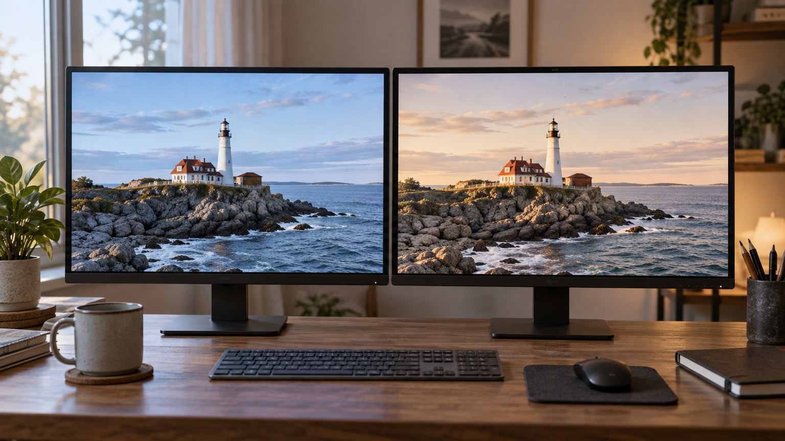
When a photograph looks warmer on a phone and darker on a laptop, the file is not necessarily wrong. Displays differ in brightness, colour reproduction and settings, while applications may handle colour information differently. The room and the screen's surroundings also change perception. Editing the image immediately to satisfy one device can make it less consistent elsewhere.
Begin by confirming that both devices show the same exported file. A messaging service may have resized or processed one version, or one screen may be showing an older export. Transfer a known copy and compare its dimensions and filename. For an important diagnosis, a file hash can confirm identical bytes, but a clear transfer and version record is usually enough to eliminate a simple mix-up.
Remove avoidable viewing differences
Place the screens in comparable ambient light and avoid a bright window reflecting in one of them. Turn off temporary night modes, automatic colour-temperature shifts and vivid display enhancements while comparing. Fix brightness rather than letting one device change it automatically during the test. These steps do not calibrate the displays, but they remove several obvious variables.
Look at the image straight on. Some screens change contrast or colour when viewed from an angle. Compare at similar image size and with a similar surrounding background. A photograph filling a dark editor window can feel brighter than the same photograph surrounded by a white webpage. Match the conditions before attributing the difference to the file.
Use the same application on one computer to compare the file on two connected displays where possible. Then compare two applications on the same display. The first test emphasises the display path; the second helps reveal an application-dependent difference. Neither test is perfect, but separating these changes is more informative than comparing different hardware, software and files all at once.
Check colour information before altering pixels
An embedded image profile describes how the file's colour values should be interpreted. A display profile describes the display's response. Colour-managed software uses such information to make a translation; it cannot make every device reproduce colours outside its capabilities. Check that the image has the intended profile and that the operating system uses an appropriate profile for each display.
Do not randomly assign a profile until the picture looks pleasing. Assignment changes the interpretation of existing values, while a proper conversion aims to preserve appearance in another colour space. If a file has lost its profile, identify its known export history before deciding what to attach. Guessing can hide one mismatch while creating another.
For work where consistent colour matters, calibrating and profiling the main editing display with suitable equipment creates a more controlled reference. Keep its settings and viewing environment stable afterwards. A profile made for one display is not a generic correction for another model or even necessarily another unit. The process improves predictability; it does not guarantee identical appearance on every viewer's phone.
Try a familiar reference photograph containing skin, neutral areas and saturated colours alongside the image in question. If both photographs shift similarly on the second screen, investigate that screen and application before changing your edit. If only the new file changes strongly, inspect its export settings, profile and whether it uses an HDR delivery that the two viewing paths handle differently.
A practical endpoint is a sound master viewed on your controlled reference, plus an export that follows the destination's requirements. Check representative devices for severe problems, but do not create endless compensating edits for every screen. Record any repeatable mismatch and its conditions. That evidence is more useful than deciding that the brighter or more saturated display must be the accurate one.